Greenland model could help estimate sea level rise

February 1, 2016

Sue Mitchell
907-474-5823

University of Alaska Fairbanks mathematicians and glaciologists have taken a first step toward understanding how glacier ice flowing off Greenland affects sea levels.

Photo by Martin Truffer..  A tent sits in camp on the edge of the Jakobshavn Isbræ in Greenland.
Photo by Martin Truffer.. A tent sits in camp on the edge of the Jakobshavn Isbræ in Greenland.


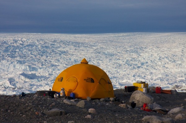
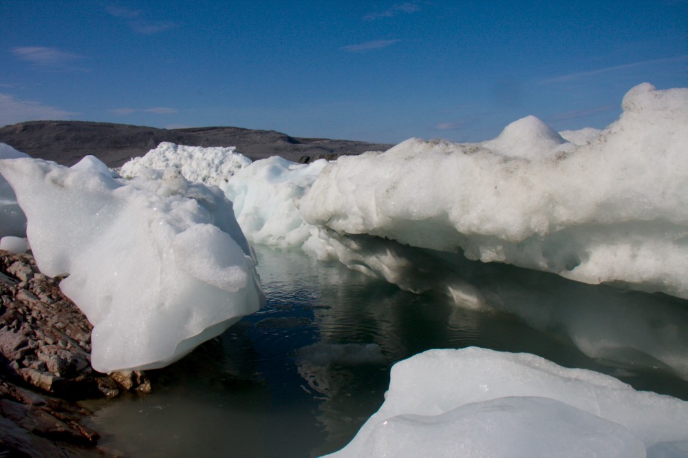
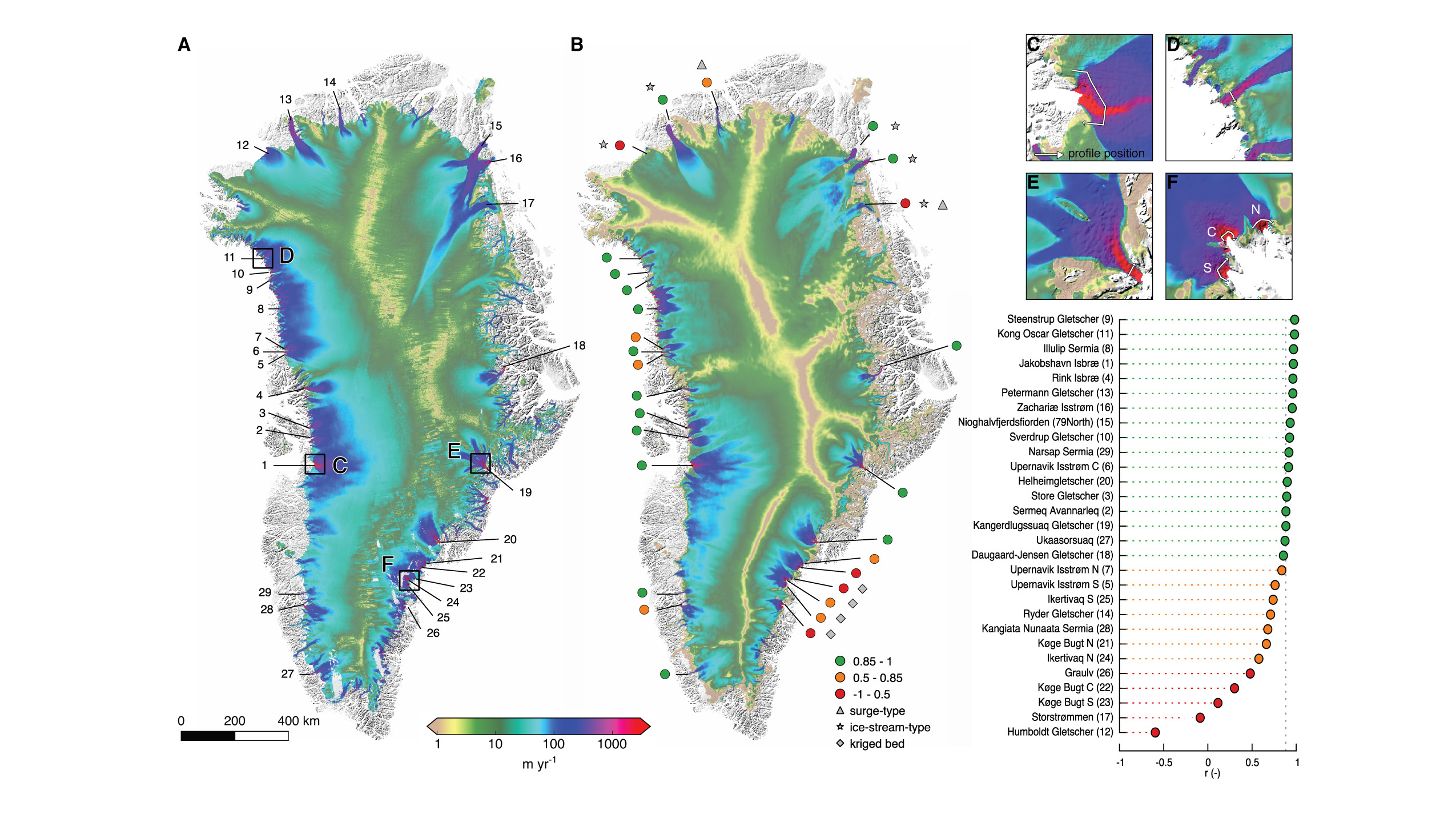
Andy Aschwanden, Martin Truffer and Mark Fahnestock used mathematical computer models and field tests to reproduce the flow of 29 inlet glaciers fed by the Greenland ice sheet. They compared their data with data from NASA’s Operation IceBridge North aerial campaign.

The comparisons showed that the computer models accurately depicted current flow conditions in topographically complex Greenland.

The work by the three researchers, all with UAF’s Geophysical Institute, is featured in the latest edition of Nature Communications.

The time was right for the comparison, said Truffer, a physicist in the Geophysical Institute's Glaciers Group.

“Better computer models and NASA’s high resolution data set made the difference,” he said. “Each part needed each other to make sense. It couldn’t have happened without either.”

The work has taken over a decade, hindered by the ability to understand the thickness of Greenland ice. The NASA campaign provided that information, using an advanced ice-penetrating radar developed by the University of Kansas Center.

These maps use colors to show actual and modeled surface speeds on Greenland’s ice sheet. The map on the left, A, reflects speeds observed in 2008-09. The map on the right, B, reflects modeled speeds at a grid resolution of 600 meters. The colored dots around the model map and in the list at right indicate the degree of correlation between the observations and the model’s predictions at cross-profiles of 29 outlet glaciers along Greendland’s coast. Green dots represent high correlation, while orange dots represent moderate correlation and red dots represents lesser correlation. The smaller inset maps show simulated surface speeds of Jakobshavn Isbræ (C), Kong Oscar Gletscher (D), Kangerdlugssuaq Gletscher (E), and Køge Bugt (F). White lines on the inset maps indicate the position of the cross-profiles.
“The result has been a substantial improvement in our knowledge of subglacial topography, particularly in the deep channels feeding outlet glaciers,” the three wrote in the Nature Communications article.

The three now want to see if the model can accurately predict how sea levels might be affected by a melting Greenland ice sheet.

ADDITIONAL CONTACT: Andy Aschwanden, 907-474-7199, aaschwanden@alaska.edu; Martin Truffer, 907-474-5359, truffer@gi.alaska.edu; Mark Fahnestock 907-687-6371, fahnestock@gi.alaska.edu

ON THE WEB: Geophysical Institute: gi.alaska.edu. Nature: http://bit.ly/1nZthvb

Photo by Martin Truffer. .  A spot where the Jakobshavn Isbræ is melting.
Photo by Martin Truffer. . A spot where the Jakobshavn Isbræ is melting.